![]()
可以实现文字大小随着屏幕的放大而放大,高度和宽度等比例缩放
类似于 em,em 是父元素字体的大小,rem 是相对于 html 的字体的大小
1
2
3
4
5
| 语法规范:
@media 媒体类型 and|not|only (媒体特性){
css代码
}
|
满足条件后执行 css 代码
# 媒体类型
| 类型 | ,说明 |
|---|
| all | 所有设备 |
| print | 打印机和打印预览 |
| scree | 电脑屏幕,平板电脑,智能手机等 |
# and Only Not
| 属性 | 说明 |
|---|
| and | 和多个媒体类型连一起 |
| only | 指定某个特定的媒体类型 |
| not | 排除某个媒体类型 |
# 媒体特性
| 属性 | 说明 |
|---|
| width | 输出设备可见区域宽度 |
| min-width | 输出设备可见区域最小可见宽度 |
| max-width | 输出设备可见区域最大可见宽度 |
# 媒体查询 + rem 实现不同尺寸的元素大小变化
1
2
3
4
5
6
7
8
9
10
11
12
13
14
15
16
17
18
19
20
21
| div{
width:1rem;
height:1rem;
}
<div>媒体查询</div>
-----------------------------------------------------------------------------------------
css
//媒体查询从小往大。
@media screen and(minwidth:350px){
html{
font-size:45px;
}
}
@media screen and(minwidth:650px){
html{
font-size:90px;
}
}
|
# 引入资源
样式比较繁多的时候可以针对不同的媒体开发不同的 style 样式表,在 link 中判断设备尺寸,引入不同的 css 文件
1
2
| 语法:
<link rel="stylesheet" media="媒体查询类型 and/not/only (媒体查询属性值)" href="style.css">
|
Html
1
2
3
4
5
6
7
8
9
10
11
12
13
14
15
16
17
18
19
| <!DOCTYPE html>
<html lang="en">
<head>
<meta charset="UTF-8" />
<meta name="viewport" content="width=device-width, initial-scale=1.0" />
<title>Document</title>
<link rel="stylesheet" media="screen and (min-width:300px)" href="50.css" />
<link
rel="stylesheet"
media="screen and (min-width:800px)"
href="100.css"
/>
</head>
<body>
<div>1</div>
<div>2</div>
</body>
</html>
|
50.css
1
2
3
4
5
6
7
8
9
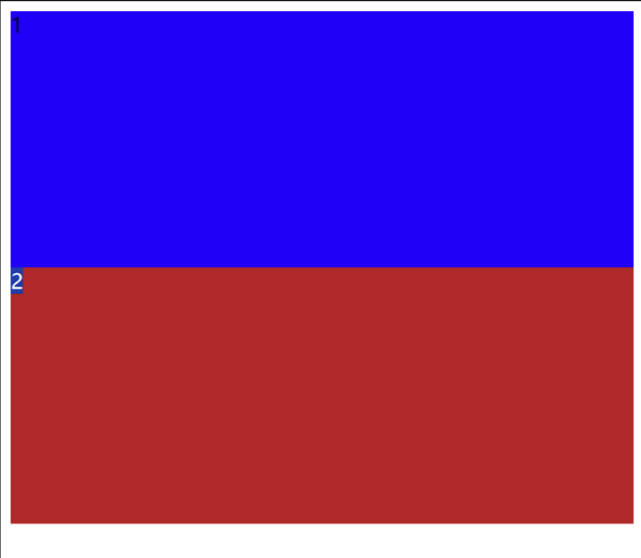
| div {
width: 100%;
height: 200px;
background-color: rgb(33, 0, 246);
}
div:nth-child(2) {
background-color: #b02929;
}
|
100.css
1
2
3
4
5
6
7
8
9
10
| div {
width: 50%;
height: 200px;
background-color: #da9514;
float: left;
}
div:nth-child(2) {
background-color: #b02929;
}
|
100
![]()
50
![]()


